Project Info
Project role: 2019 - 2020 UX/UI Designer collaborating with the UX/UI Manager
2020 - Present UX/UI Lead
Project time: Ongoing since 2019
Please note: Some sections of these designs have been removed for legal reasons. Logos reflect 'Mitrefinch', this product is now owned by 'OneAdvanced'. The designs reflect the UI of the terminal/device only, not the desktop product it connects to, as much as I would love to get my hands on it.
results
Final designs
2020 - Present UX/UI Lead
Project time: Ongoing since 2019
Please note: Some sections of these designs have been removed for legal reasons. Logos reflect 'Mitrefinch', this product is now owned by 'OneAdvanced'. The designs reflect the UI of the terminal/device only, not the desktop product it connects to, as much as I would love to get my hands on it.
The Challenge
Employees need a fast and easy way to clock in and out of their workplaces. This is done via a touch screen within a wall mounted 'device/terminal' that is located at the employee entrances of the workplace. The clocking should have minimal impact on the employee's shift start/end times and gives them flexibility over their workload.
The Research
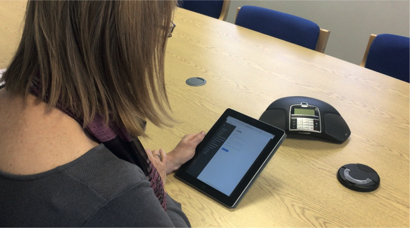
Observing the Current System
• Slow to use
• Boring/Janky - Occasionally breaks
• Users seem to get frustrated with it - especially when clocking doesn't work first time.
• Functional but no 'modern feel'.
• Large manager time burden.
• Tablets get moved/lost/misplaced which causes more time to get logged in.
User Interviews and Observations
• Warehouse Manager
• Warehouse Employee
• Company/Distribution centre Manager
Scope discussions with Developers
• Discussing any limitations there are within the device, what level of code can we use? Can it operate CSS?
• How fast is the device?
• Is the terminal holding any data on it, does this effect processing power? What is the processing power?
Observing use of the current system
This product's first Personas and empathy mapping
I joined this product and realised that they had never done personas! I then conducted a workshop (remotely in Miro) with a handful of people from the product, design, devs, support and sales teams to create them based off our knowledge and existing research, starting with empathy mapping.
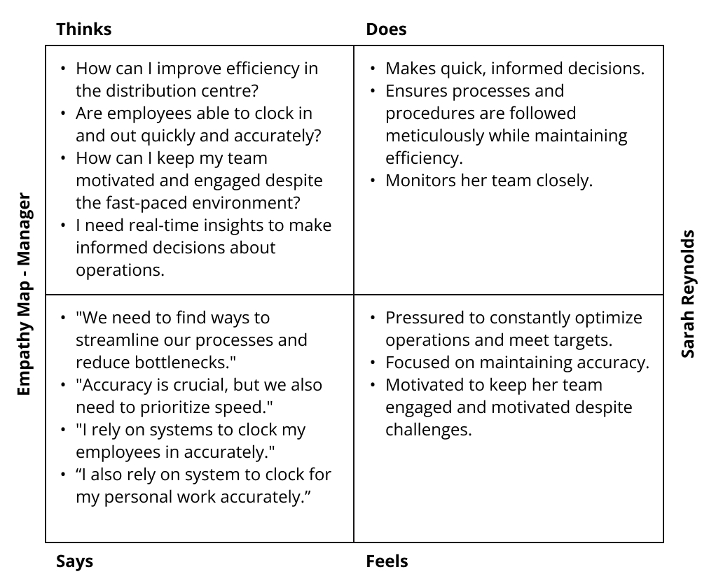
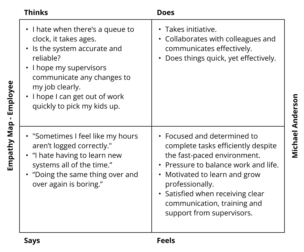
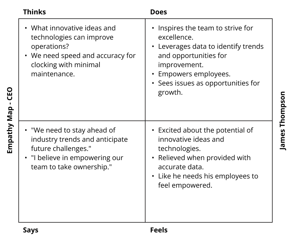
I never have personas without empathy mapping, I feel it's the best way to look at a persona as a human, and not a scientific, clinical response to research.
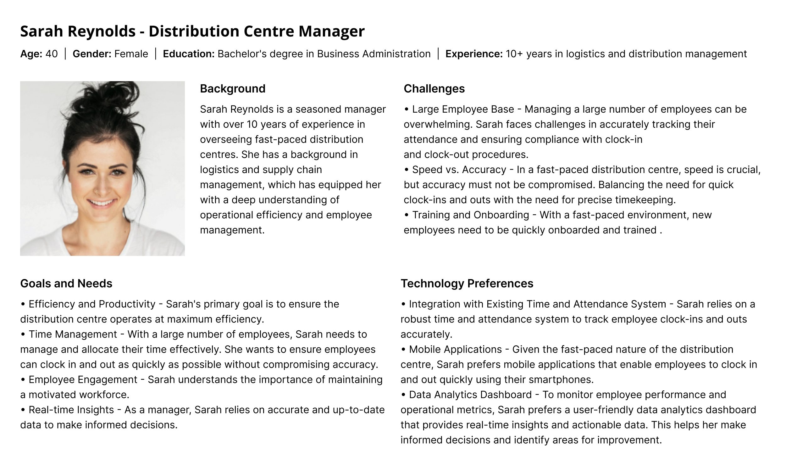
Sarah has large employee bases and tonnes of experience, a really high value user!
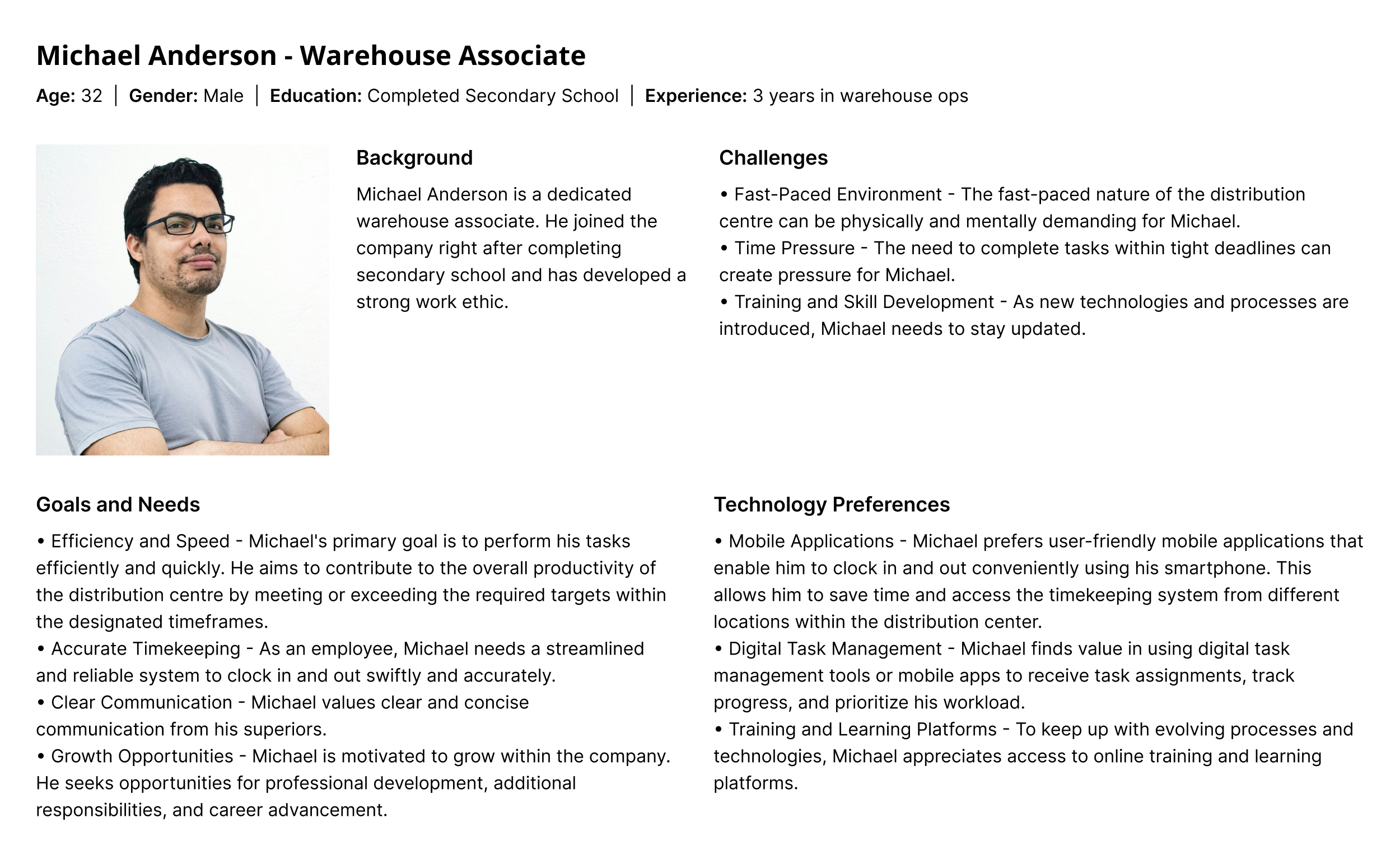
Michael works under pressure and just need the tech he has to use, to work quickly and accurately.
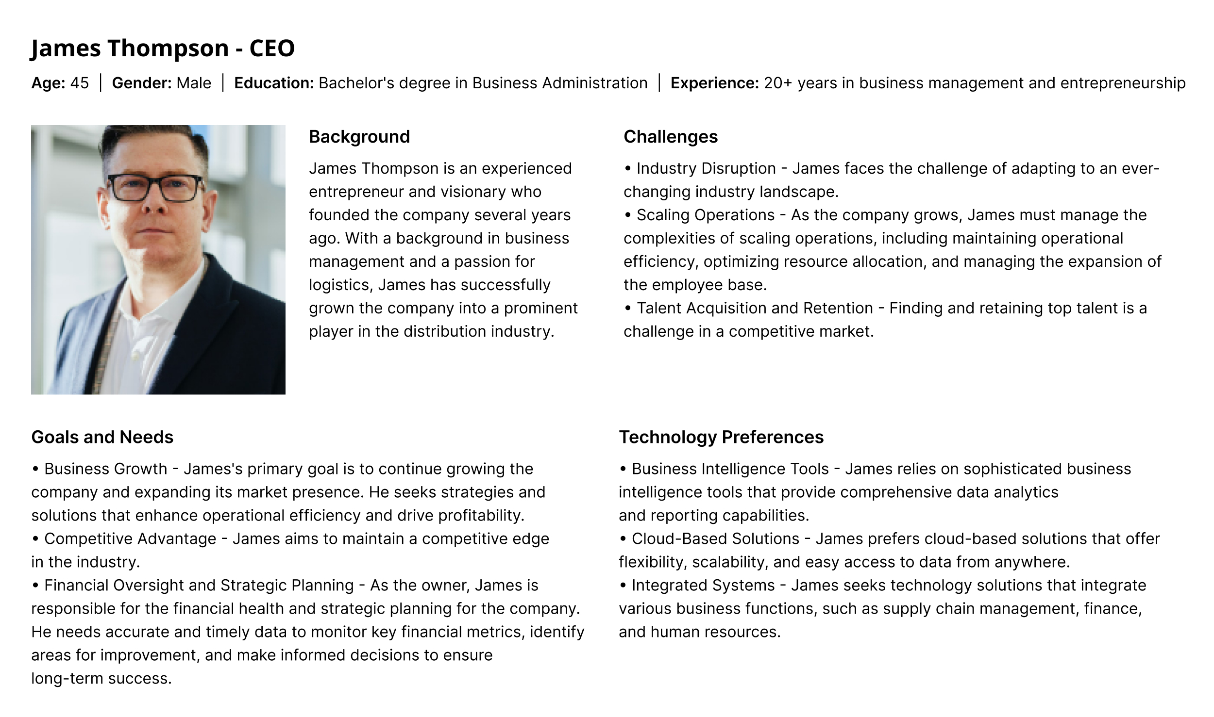
James is very experienced, but not too involved with the day-to-day and is focused on high level business practises and wants tech to help with growth and efficiency.
Research Findings - How Might we?
• Support high staff turn over
• Ensure onboarding can be quick and done in bulk, that there is minimal training time on the clocking system and that employees should be able to 'pick up and play'. - Both Managers and Admins, had this concern
• Ensure that there is minimal room for error, this wastes time.
• Ensure any errors can be quickly undone.
• Include speed and precision when using the system.
• Ensure a high level of accessibility. - Poor accessibility as standard will cause more mistakes.
• Create support for employees where English isn't their first language. Including simple language and intuitive iconography and assistive animations.
• Ensure that I am keeping in mind that the device has limited capabilities for processing design and so we will have to work within its limits, especially when it comes to interaction design.
• Current access control systems are 'boring'. - Comment from users fitting the 'employee' persona.
Functionality and Layout
• In order to make the product quick to use, I included larger buttons to reduce the amount of mistakes made when clocking in.
• Including the image of the employee at the end to confirm they have logged in without the need to spend the time reading the screen, while still having the option to read the clock in time. - This is especially important for users who don't have English as their first language.
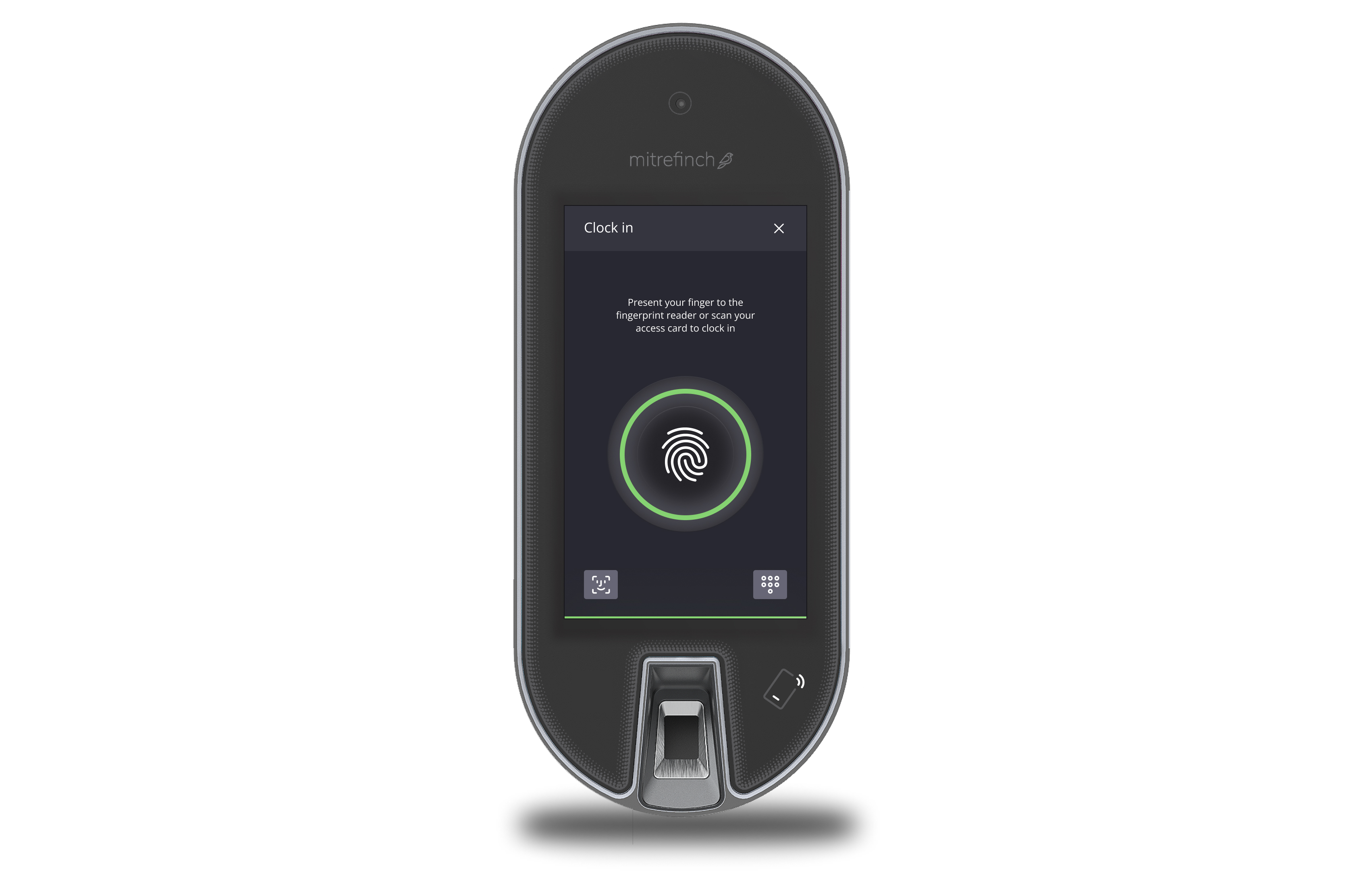
• Keypad option for users to have a quick alternative option to log in if the fingerprints fail - an idea as a result of developer collaboration and was eventually validated in usability testing.
• Including the image of the employee at the end to confirm they have logged in without the need to spend the time reading the screen, while still having the option to read the clock in time. - This is especially important for users who don't have English as their first language.
• Keypad option for users to have a quick alternative option to log in if the fingerprints fail - an idea as a result of developer collaboration and was eventually validated in usability testing.
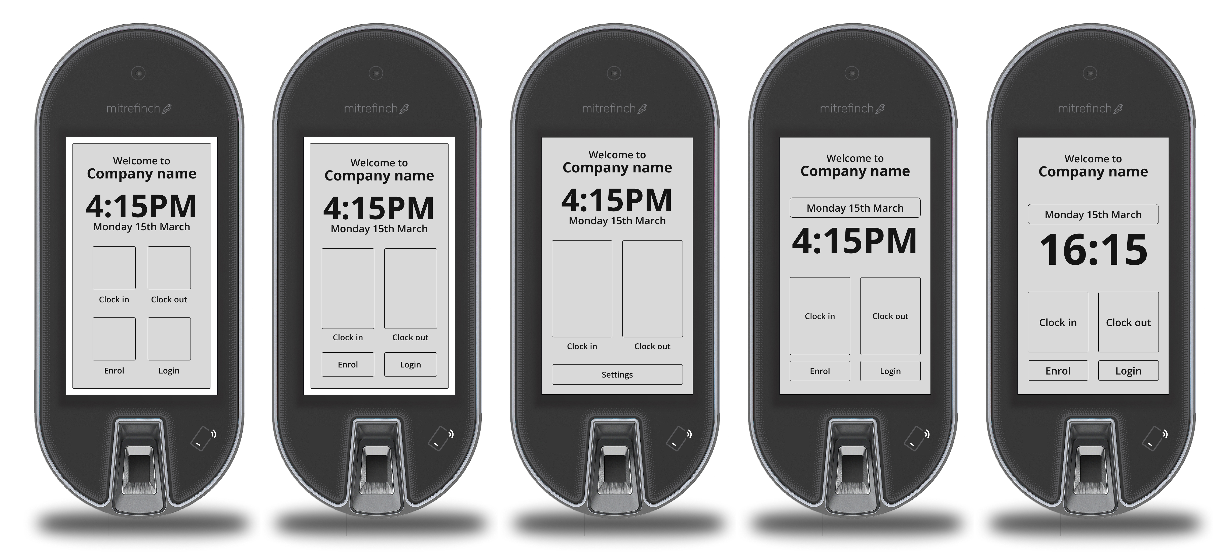
Wireframes showing the evolution of the button sizing on the terminal homepage. I ensured that we made them a large, accessible size (following NN research) and our own testing in order to minimise mistakes and avoid wasting valuable time when clocking in.
I also included buttons that go straight to the functionality, rather than lots of clicks. I also included more white space so that both the UI and information is clearer, something proven in testing.
I also included buttons that go straight to the functionality, rather than lots of clicks. I also included more white space so that both the UI and information is clearer, something proven in testing.
user Feedback After initial testing
User testing sessions were conducted by myself alongside the PO.
Actionable Feedback - in order of severity (from need to fix now to need to fix soon)
• Height of the device placement on the wall can cause problems for people in wheelchairs or shorter than average users. How do we ensure we are being fully inclusive here?
• Can we make it even faster? - The devs loved this response.
• Logging in/out feels repetitive. - 'It's a boring part of my day'
• Employee ID alternative login option would be handy. - This would obviously be specific to each
Positive Feedback
• Design is 'slick' - 'a big improvement on our current system'.
• Is nicer to use than our current clocking system, but 'clocking system's can't really be 'fun' can they?' - They can!
• Is quick and easy to understand - 'This will save us so much time already'.
• Love the visual confirmation that it's 'me' with the profile picture and the time of clocking on a big and clear display.
Design Changes Based on Feedback
• Discuss with the product manager a way that we can ensure that the product installers are aware of wheel chair heights and product inclusivity. After speaking to the Product Manager he had already informed me that there was a plan for this in place and education was being provided.
• Including fun yet slick interactions to confirm and to make a repetitive experience more interesting to look at without adding too much visual noise.
• Asessed whether there are any steps to remove from the logging in process in order to increase the speed of logging in. Discussed with the developers about whether there is anything we can do to speed up the process.
The clocking animation I included, making a 'boring and repetitive' process more interesting. Error handling is also included.
Increasing Digital and physical Accessibility
Considerations
• Touch to speak functionality with large button surface areas. (This also helps with speed).
• Fast processes to allow for low needs for standing/sitting for long periods of time.
• Standard colour contrast compliance to AA level.
• Could the use and inclusion of haptics be helpful?
• Consider haptic feedback for physical confirmation - Not COVID safe and out of scope for this phase, would need a significant hardware upgrade, may not make financial sense over benefit.
• Gesture control would have helped increase accessibility if there were the time and budget to be able to implement it. - Out of scope for this phase.
Decision
The speed needed for this product plays into the accessibility here, however we should consider and include the following:
• Large buttons where possible!
• Standard colour contrast - No current scope to make changes to existing design system in order to make it fully AA compliant, a new fully accessible design system is coming soon.
Changes and considerations Due to COVID
The Problem
The Access Control product has been developed and designed with fingerprint recognition and touch screen as the core USPs of the product. How can we ensure that users can use the product safely while also ensuring that we don't stop the fast workflows that we have created.
Exploration of Facial Recognition and Gesture Control within the Terminal
• How user friendly is it (obviously)?
• What is the impact on the time to including this?
• What is the impact on the user to include this?
• What is the impact on the UI, we don't have lots of retail space as it is.
• Do we include one, or both?
• What is the impact on accessibility, does it increase/decrease it?
• Does gesture control have enough adoption in the world as of yet?
• How feasible to develop is it? Does this create scope creep?
Early design exploration for Face Print/Facial Recognition.
Early design exploration for gesture control.
Exploring transitions for a 'Face Print/Facial Recognition. - It's not the most aesthetic animation in the world, but it did the job.
It was very clear, early on that gesture control was not something that we could achieve during the timescales.
Facial recognition - Testing/Exploration Results - Success (Sort of)
• With budget and time constraints that we have had, this was not possible to implement during the first phase, but can be for the second phase of releasing.
• Facial recognition would help to increase accessibility, within time contraints I feel that we couldn't get the functionality to a good enough standard to increase accessibility. However, we cannot ignore the system's current lack of touch to speak when using the touch screen.
• Good UX understanding due to the wide use of smart phones.
• The design needs some further work and further UX testing on real world use cases during the second phase.
• Including both facial recognition and gesture control appears confusing within the UI.
Gesture control - Testing/Exploration Results
• Current low UX adoption and would therefore need lots of training and input from support.
• It wouldn't have increased accessibility as we would have to rely on users having good levels of mobility.
• UI appears cluttered and messy.
Please note: Testing was completed via speaking to users online, gathering opinions and feedback. Testing with the device was not possible during this phase.
Results
How are we measuring success?
• There is no impact on our employees that implement the current devices, (e.g. Mitrefinch/Advanced have been making clocking systems for years.) - Partial success - While the employees implementing the T2 understood the UI, because it was so different to the old '90s' systems, some training was still needed.
• Pendo shows that the functionality has been regularly and repetitively used over a 30 day period. - Success - Usage is consistent and time to clock is faster with a reduction in users needing to use their employee numbers to clock.
• There is minimal impact on the development team. - Success - No further work is scheduled on this functionality.
• There is minimal impact on both support and the product team. - Success - PO/PM are happy
• We have addressed the 'HMW'.
Did we solve our 'HMW'?
• Handle high staff turn over - Success - We have found that minimal to no training is needed for new employees to understand how to clock in and out. Employee data can be uploaded easily and in bulk (not part of this workflow however.
• Onboarding needs to be quick and done in bulk, minimal training time on the clocking system, employees should be able to 'pick up and play'. - Fail - Users can't install the device themselves and while users can understand how to clock in/out easily. Some level of support is needed when installing and onboarding users
• Minimal room for error, this wastes time. - Success - There is a strict workflow with a fallback using the codes.
• Any errors need to be quickly undone. - Success - 'Try again' workflows built in as standard and fallbacks throughout for any edge cases/mistakes.
• Speed and precision. - Success - This is a fast and accurate process that can be repeated again and again.
• Poor accessibility will cause more mistakes.- Partial success - While we have included some accessibility considerations, changes to the hardware need to be made in order to add things like screen readers.
• Some employees don't have English as a first language. Use simple language and intuitive iconography and assistive animations. - Unsuccessful - While I managed to include intuitive icons and simple language, I feel as though the experience isn't fully inclusive without a language translator.
• The device has limited capabilities for CSS and so we will have to work within its limits, especially for interaction design. - Success - We managed to create a well improved, slick experience that wasn't compromised by its code base.
• Current access control systems are 'boring'. - Partial Success - I added animations and worked to make the process appear 'slick', however this is a system that users are 'forced' to use as part of their job.
User Feedback
"The new template functionality is SO MUCH better, thank you for making this so much faster. We find that training new people is so much quicker too, the screen is so much easier to understand." - Distribution Centre Manager
"It's so much easier to train new people now" - Warehouse Associate
Next Steps
• Take more steps towards making the product WCAG AA 2.2 compliant - Can we incorporate improvements when we add new functionality?
• Consider product translation for users where English isn't their first language.
• Implement facial recognition.
How are we measuring success?
• There is no impact on our employees that implement the current devices, (e.g. Mitrefinch/Advanced have been making clocking systems for years.) - Partial success - While the employees implementing the T2 understood the UI, because it was so different to the old '90s' systems, some training was still needed.
• There is minimal impact on the development team. - Success - No further work is scheduled on this functionality.
• There is minimal impact on both support and the product team. - Success - PO/PM are happy.
• We have addressed the 'HMW'. - Partial Success - as stated below.
Did we solve our 'HMW'?
• Handle high staff turn over - Success - We have found that minimal to no training is needed for new employees to understand how to clock in and out. Employee data can be uploaded easily and in bulk (not part of this workflow however.
• Onboarding needs to be quick and done in bulk, minimal training time on the clocking system, employees should be able to 'pick up and play'. - Fail - Users can't install the device themselves and while users can understand how to clock in/out easily. Some level of support is needed when installing and onboarding users
• Minimal room for error, this wastes time. - Success - There is a strict workflow with a fallback using the codes.
• Any errors need to be quickly undone. - Success - 'Try again' workflows built in as standard and fallbacks throughout for any edge cases/mistakes.
• Speed and precision. - Success - This is a fast and accurate process that can be repeated again and again.
• Poor accessibility will cause more mistakes.- Partial success - While we have included some accessibility considerations, changes to the hardware need to be made in order to add things like screen readers.
• Some employees don't have English as a first language. Use simple language and intuitive iconography and assistive animations. - Unsuccessful - While I managed to include intuitive icons and simple language, I feel as though the experience isn't fully inclusive without a language translator.
• The device has limited capabilities for CSS and so we will have to work within its limits, especially for interaction design. - Success - We managed to create a well improved, slick experience that wasn't compromised by its code base.
• Current access control systems are 'boring'. - Partial Success - I added animations and worked to make the process appear 'slick', however this is a system that users are 'forced' to use as part of their job.
User Feedback
"The new template functionality is SO MUCH better, thank you for making this so much faster. We find that training new people is so much quicker too, the screen is so much easier to understand." - Distribution Centre Manager
"It's so much easier to train new people now" - Warehouse Associate
Next Steps
• Take more steps towards making the product WCAG AA 2.2 compliant - Can we incorporate improvements when we add new functionality?
• Consider product translation for users where English isn't their first language.
• Implement facial recognition.
Final outcome
A slick and effective clocking in system that is both aesthetic and yet not a hindrance to the company or employee when working in an environment where the precious seconds it takes to 'clock in' a large amount of employees can cost both money and time.
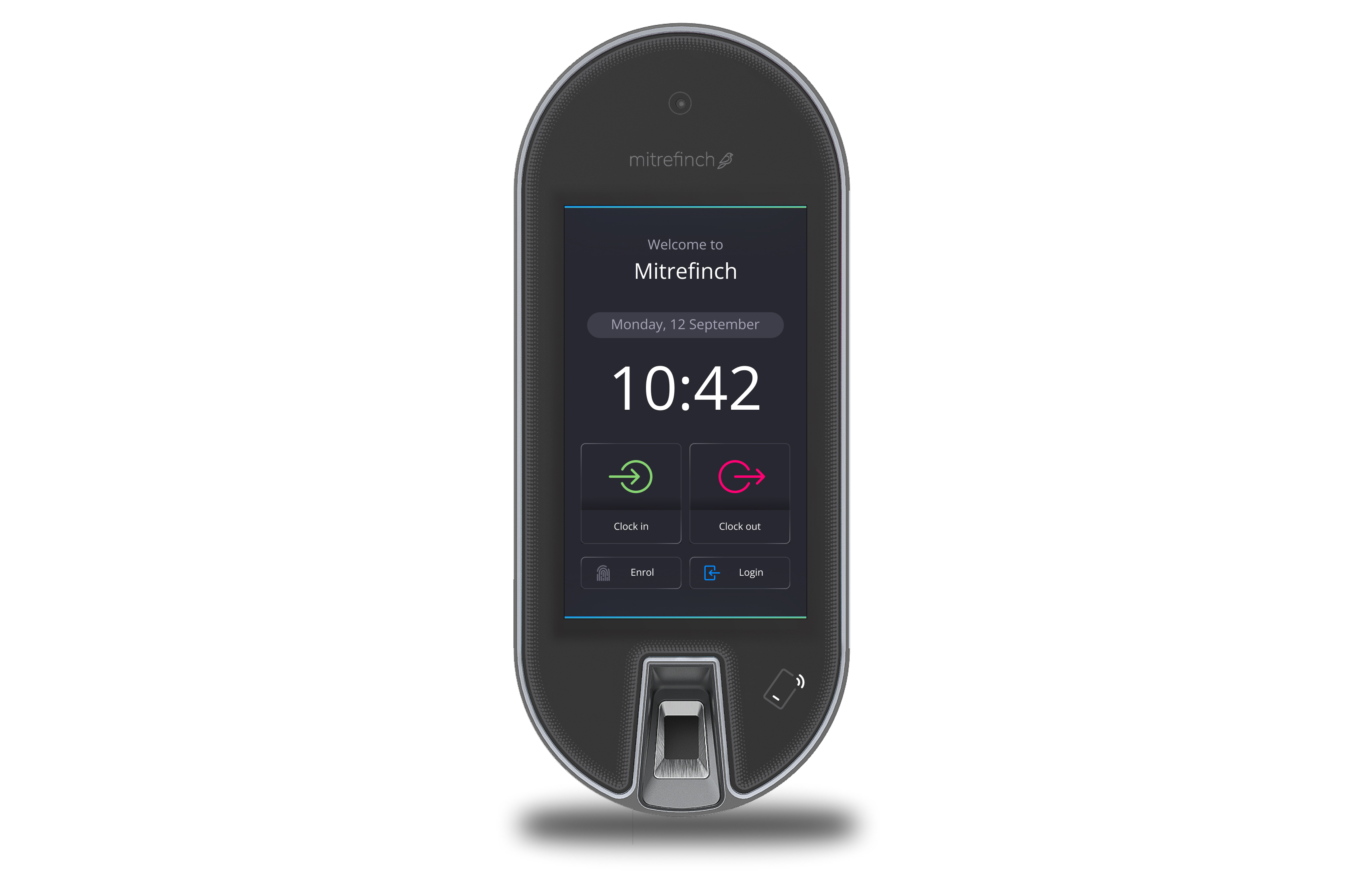
Homepage design with large buttons that are easy to tap at speed.
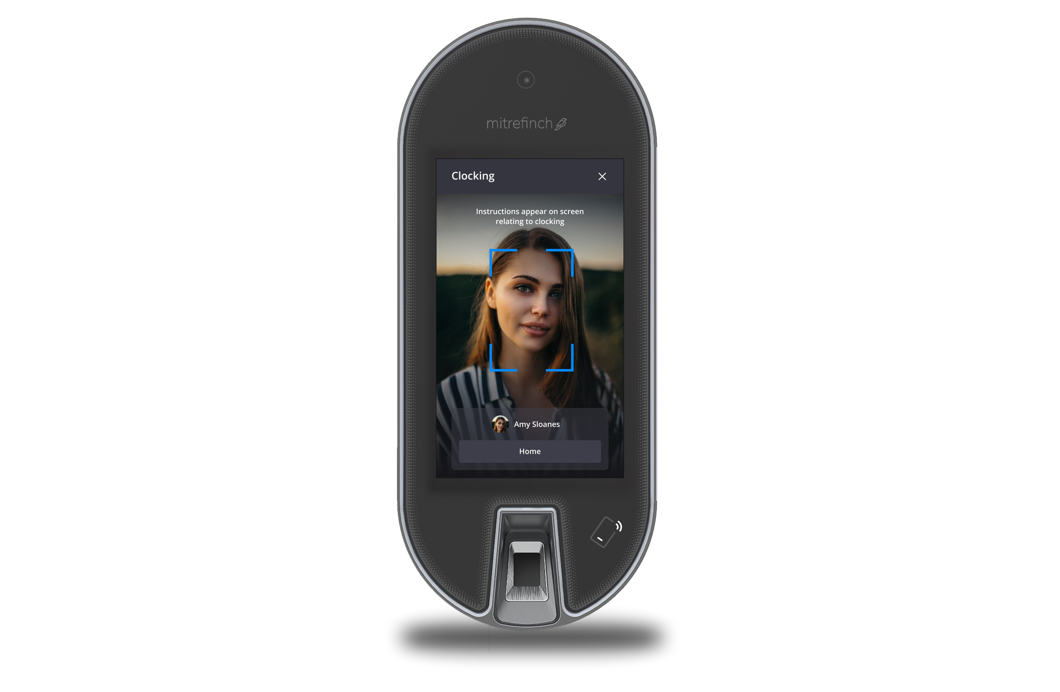
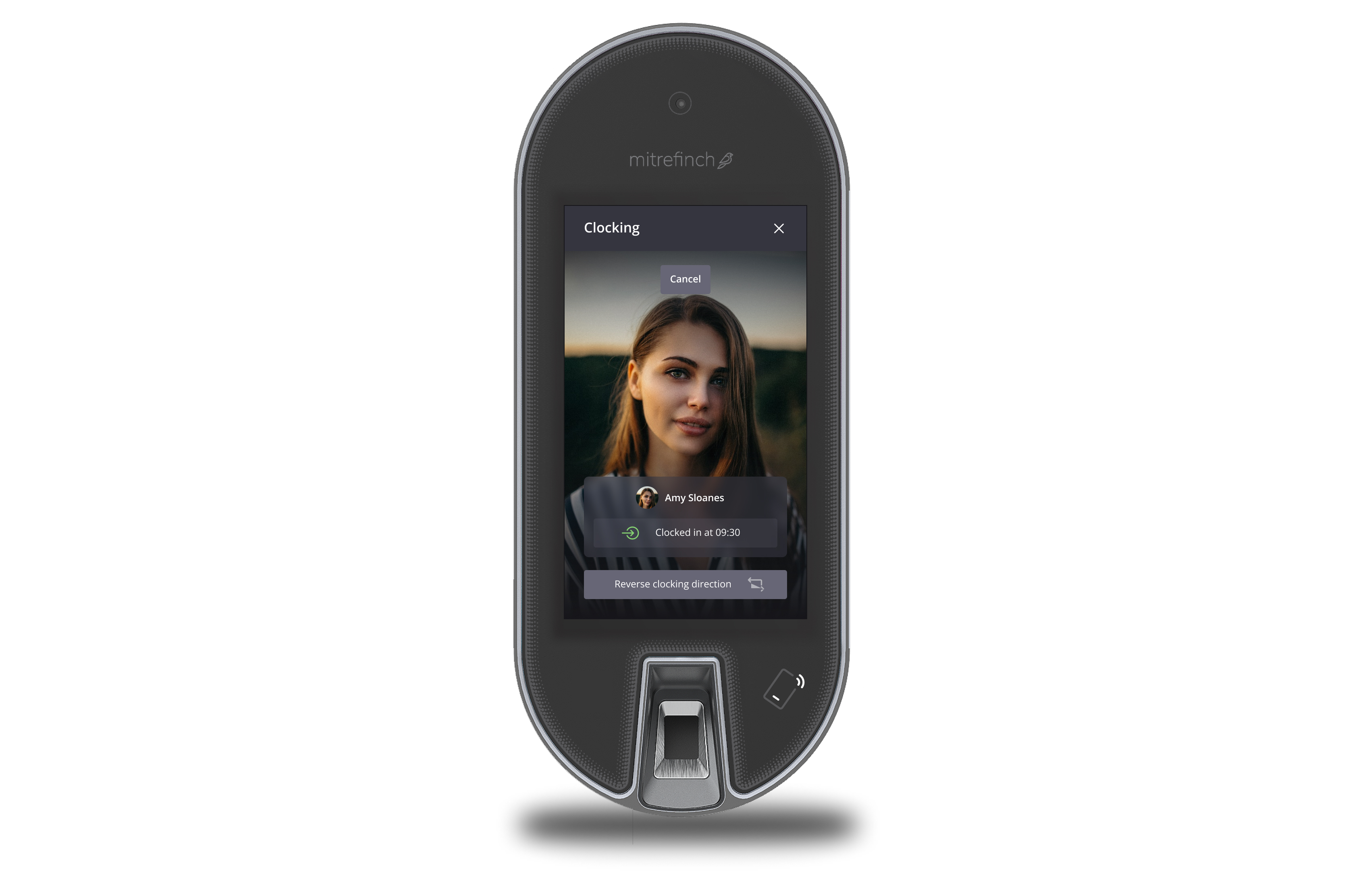
A successful clocking is clear with options to use an employee number to log in and also use facial recognition.
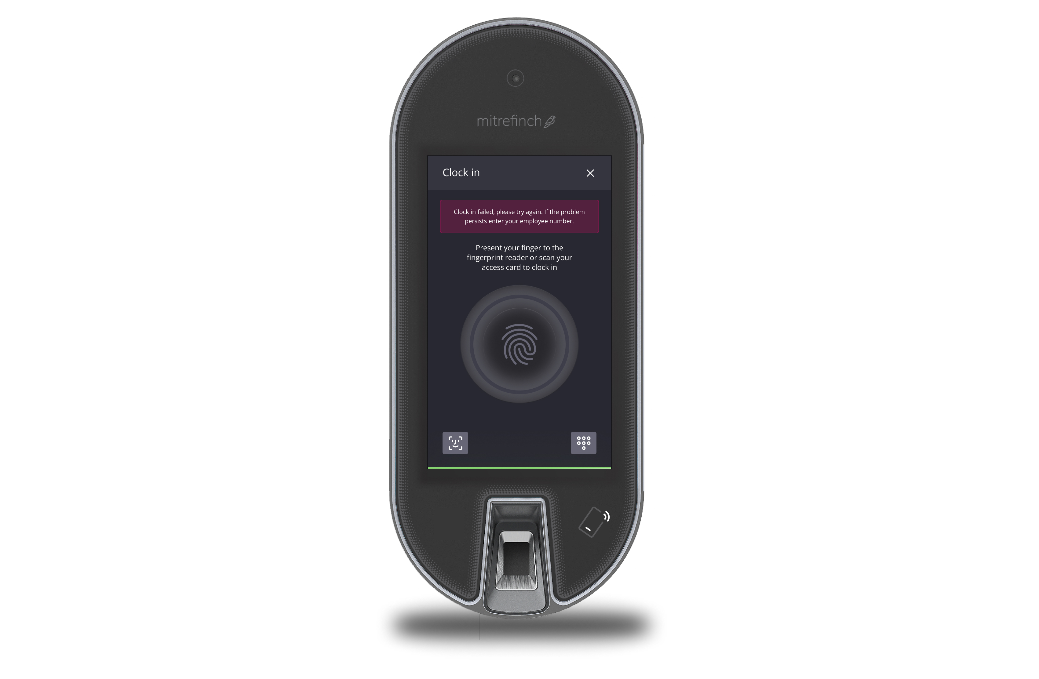
Clear error states. - I would love to do further testing on these error states so that we can validate if we can reduce the wording in order to make the process even faster, even when there are issues with scanning.
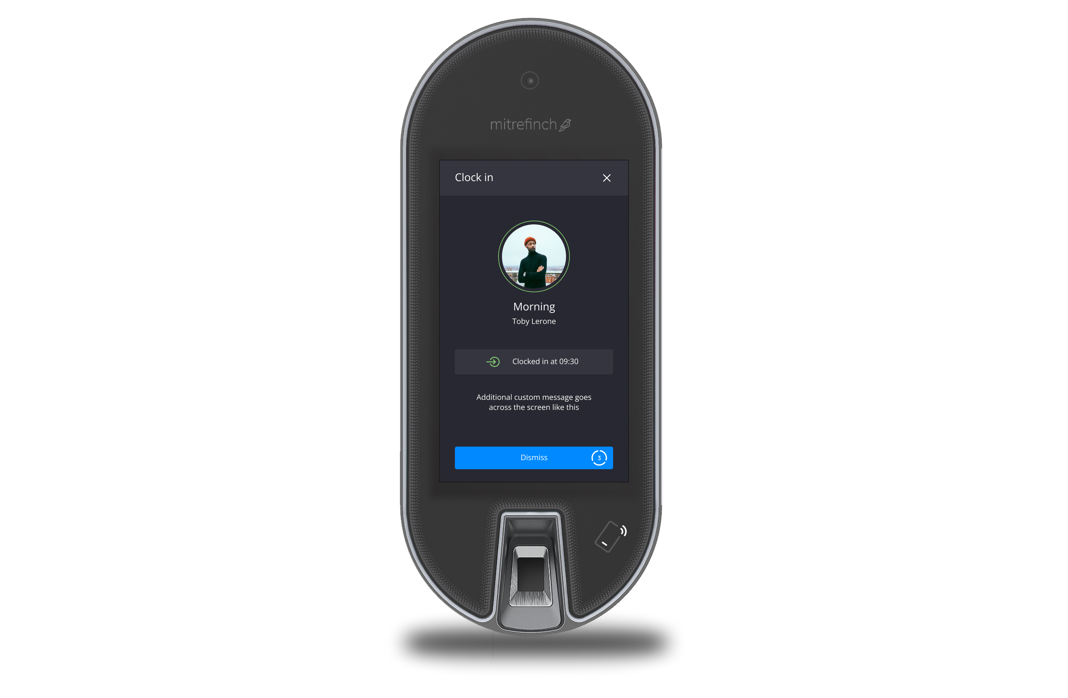
Making it clearly obivous that it is you that has clocked in.
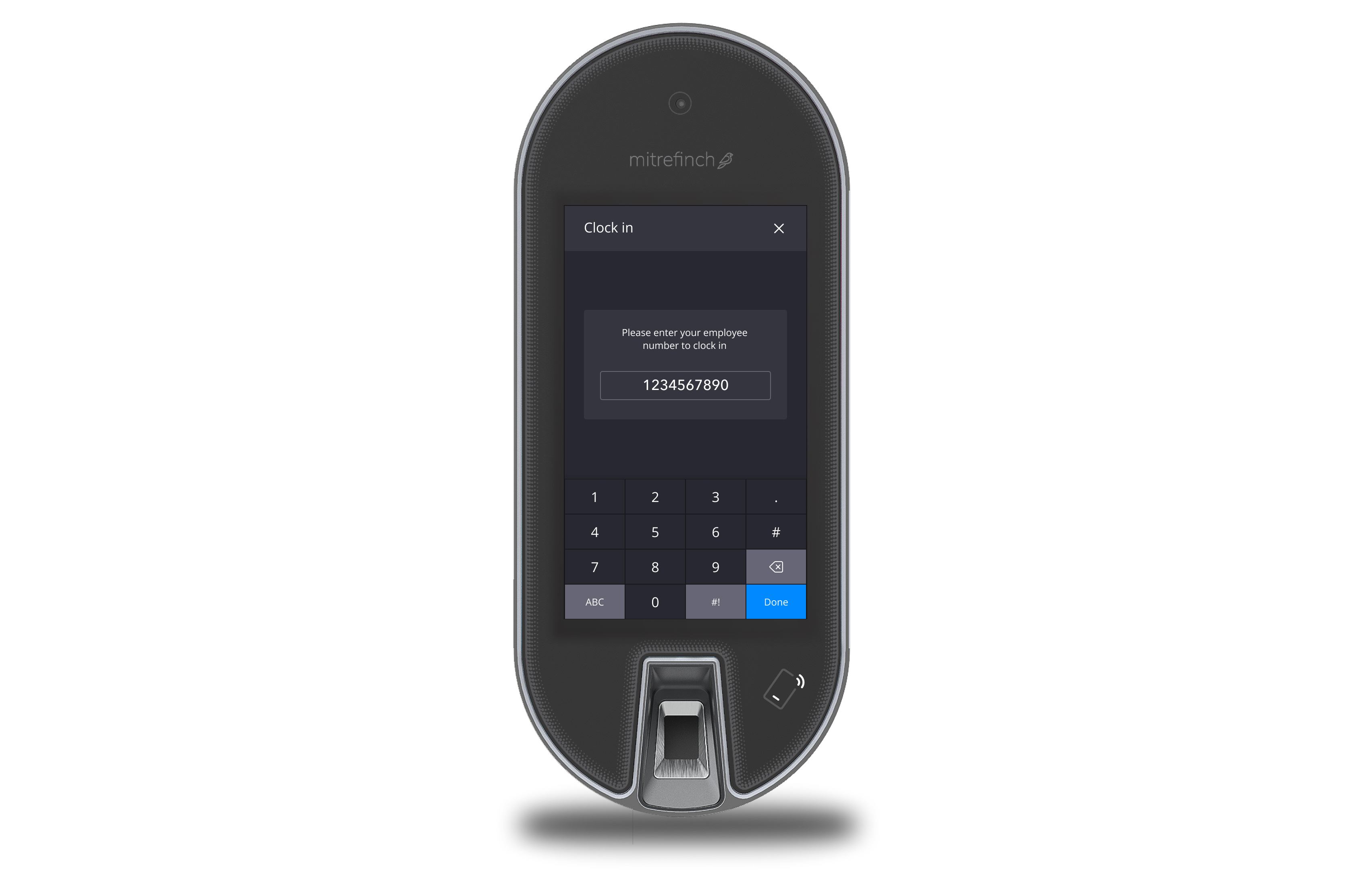
An alternative way to log in using an employee number - I just wish there was a faster alternative.
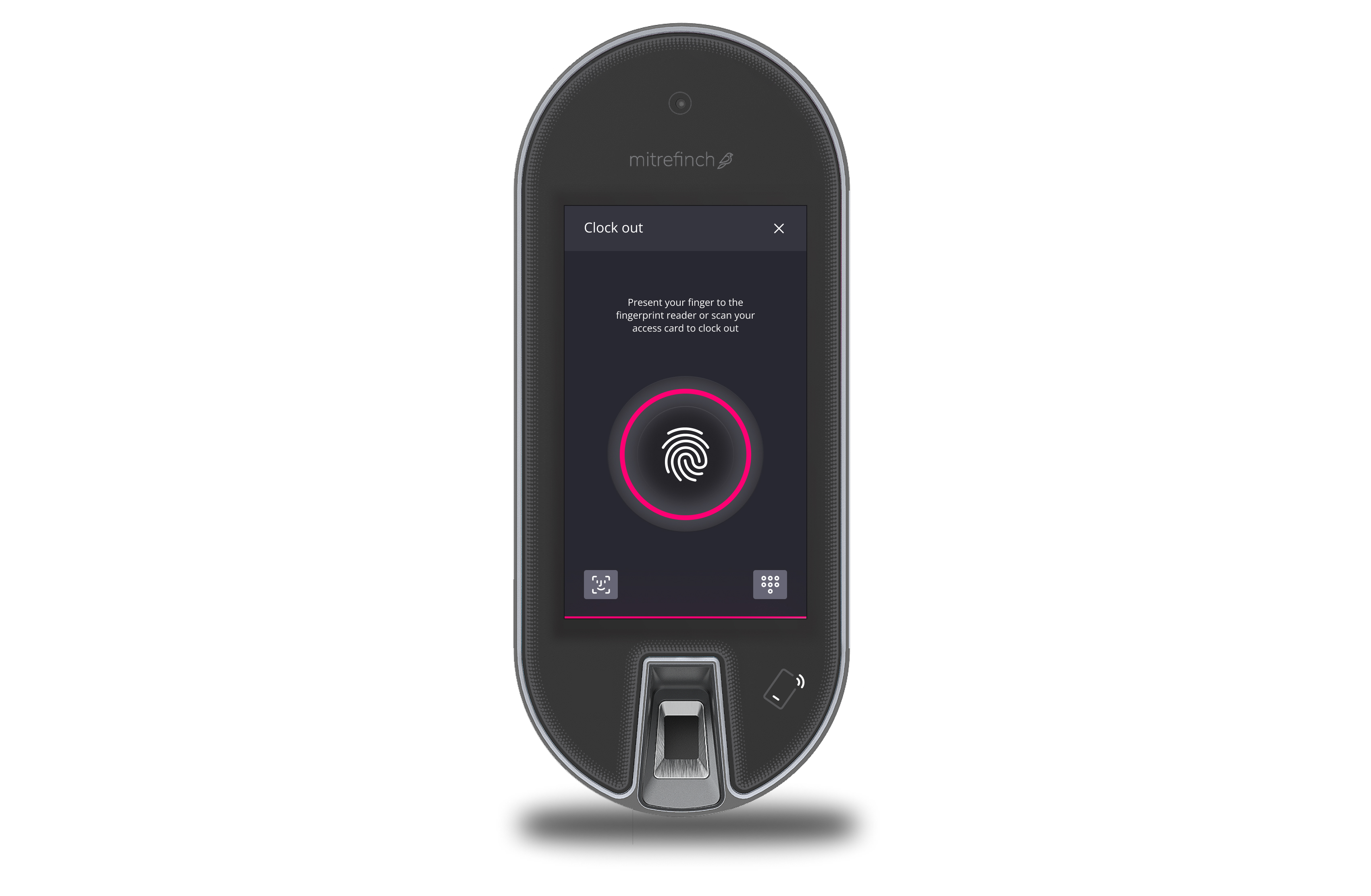
An unsuccessful clocking is clear with options to use an employee number to log in and also use facial recognition.
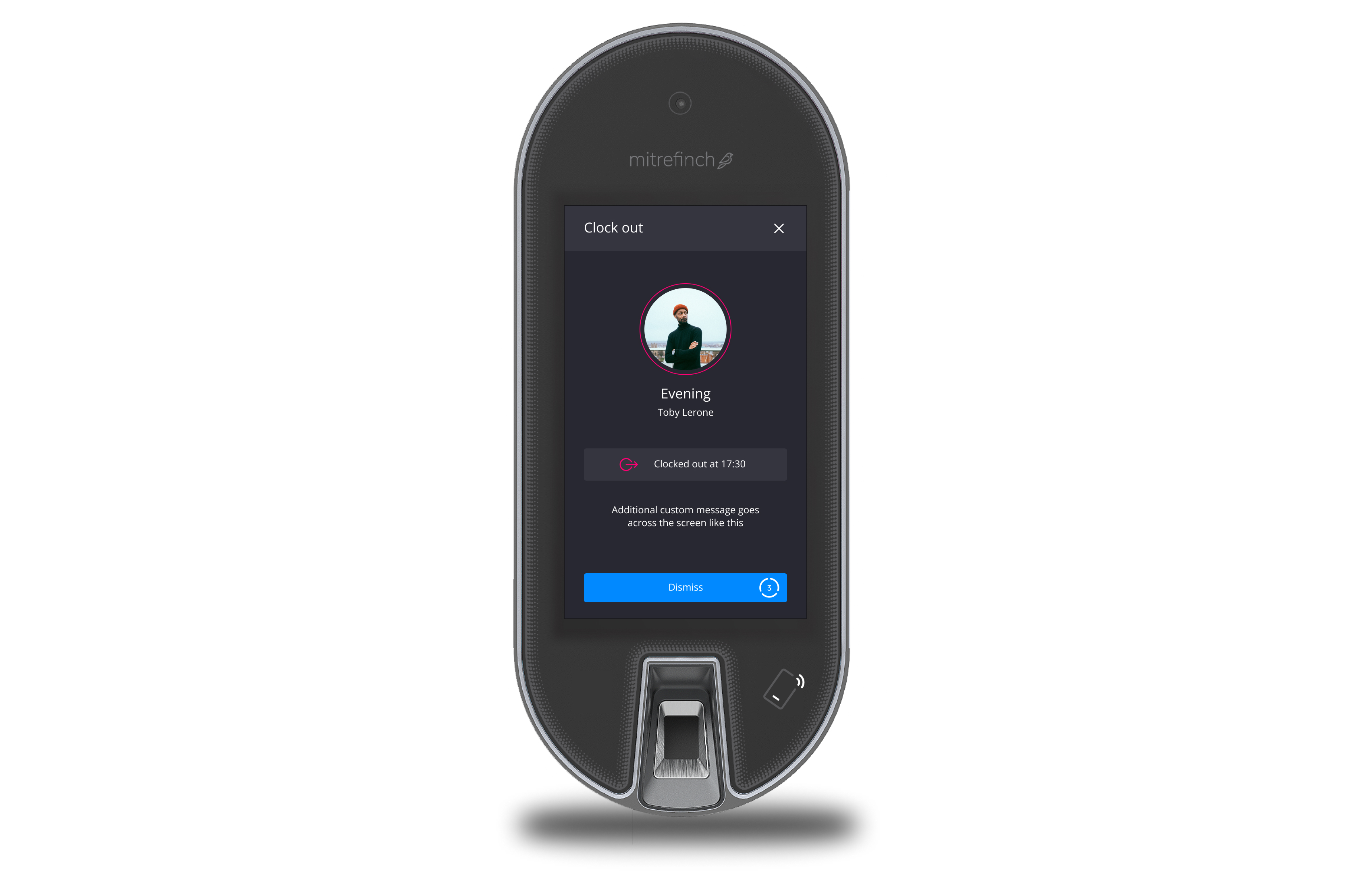
Making it clearly obvious who it is that has clocked out.
What would i have done differently
I feel that there is no need for these physical clocking stations, I feel that we could transfer most of the design from these stations into a mobile app for the employees to download, however I recognise that not everyone has a phone or would feel comfortable with a workplace app on their phone and so other allowances/alternatives/backups will always need to be made.


