Project Info
Project role: UX/UI Design Lead with collaboration with UX copy, close collaboration with payroll developers and cross-discipline. Payroll has been my baby for years and I am passionate about seeing it do well.
Project time: This piece of functionality is a snapshot of a larger on-going project.
Please note: Some sections of these designs have been removed for legal reasons.
results
Final Designs
Project time: This piece of functionality is a snapshot of a larger on-going project.
Please note: Some sections of these designs have been removed for legal reasons.
Challenge Statement
To create functionality in order to complete the BACS/FPS process and submission as part of the overall payroll process.
Current functionality exists on an older platform which has limitations and outdated UX methods this now needs transferring onto our cloud based product with UX improvements.
Current functionality exists on an older platform which has limitations and outdated UX methods this now needs transferring onto our cloud based product with UX improvements.
Understanding the problem
• The current process and functionality on the old platform is slow.
• There are currently too many confusing modals, it is easy to lose track.
• The current functionality is confusing and has too many outdated options, tabs and buttons. It is very overwhelming.
• There are currently too many confusing modals, it is easy to lose track.
• The current functionality is confusing and has too many outdated options, tabs and buttons. It is very overwhelming.
What We already know
Payroll users don't always find the classic UX patterns useful, they are extremely detail orientated, follow strict legal and industry standard processes in order to complete payroll etc and don't want any fuss (e.g. unnecessary coloured backgrounds or fancy animations).
Everything on the page must be functional and there for a reason. Otherwise, as we have found previously, users will assume it is a waste of time and in some cases can cause confusion. We do however need to ensure that the UI stands out in both an aesthetically and functional way within the payroll industry, in order to help appeal to the members of the businesses who are in charge of purchasing the product.
Everything on the page must be functional and there for a reason. Otherwise, as we have found previously, users will assume it is a waste of time and in some cases can cause confusion. We do however need to ensure that the UI stands out in both an aesthetically and functional way within the payroll industry, in order to help appeal to the members of the businesses who are in charge of purchasing the product.
The Research
• Looking at any previous data available in Pendo in order to identify existing pain points and similar successful/unsuccessful patterns/mechanisms.
• Explore existing product feedback to identify any opportunities for improvement relating to this process. Are there any quick wins too? Speak to the Customer Success and Support teams about anything they may be hearing from customers.
• As the product manager had worked in payroll for many years, pick his brains about this piece of functionality, legal requirements and industry best practises within the payroll world.
• Carry out user testing to ensure the designs meet expectations.
Legacy System Demo with a Senior Engineer - API Issues
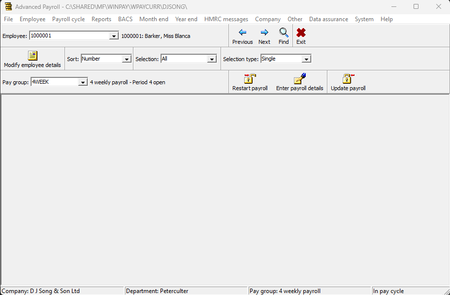
A screenshot showing the overall Payroll Desktop product. It's very Windows 98!
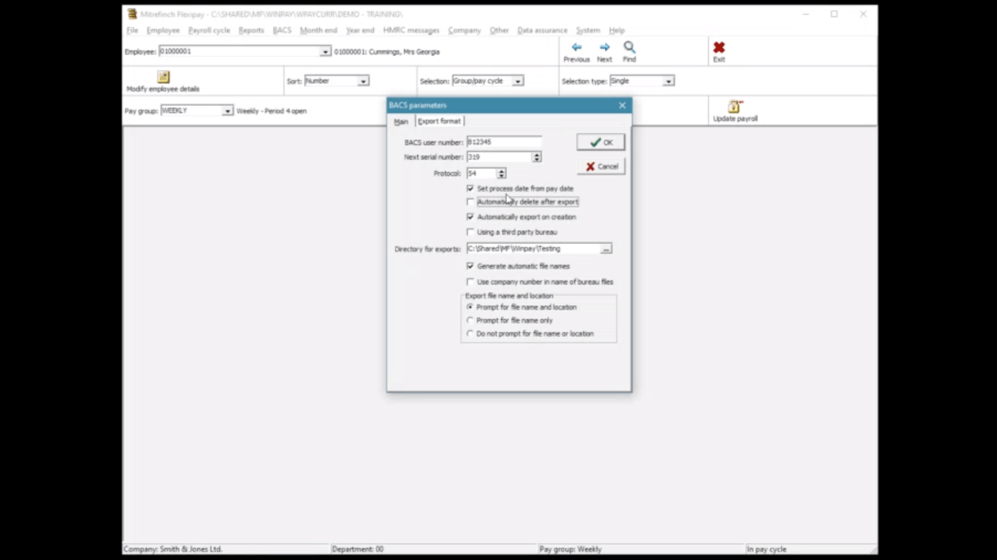
Discussing the legacy system with the engineer who originally built it, which provided lots of useful nuggets of information.
Here I took time to understand the technical limitations and scope of this functionality and discussed potential ways around it with a senior engineer for the legacy system.
We found that the API connecting the new payroll web system to the older system is not fit for purpose for this current workflow and restricted time/budget doesn't allow for API development on such a small part of the system. However, if this is a product wide issue it should be addressed via close design and dev collaboration when creating APIs in order to create a consistent UX across the platform.
Potential issues with specific functionality
• API is not capable of returning continuous data progress back to the web UI making progress bars not possible.
• Error text copy returned via the API cannot be changed.
• Certain data points aren't detailed enough to give all the info to the user that we would want to.
Potential Solutions and Discussion Points
• The API can return a log showing data transferred to HMRC. Concerns over added UI noise or relevancy, a question for the PM and PO.
• Only show error copy that is relevant and able to be clearly understood. Some copy being returned via the API is too technical. We should explore throwing up better and more relevant errors on the UI side. This is for discussion with the UX copywriter and the development team.
Research findings - How might we?
• Speed up the current process.
• Ensure users can navigate the process using tabbing and 'excel' type shortcuts.
• Ensure compliance with HMRC.
• Ensure industry best practices are incorporated into the functionality.
• Navigate technical limitations through the API in a way which doesn't effect the UX.
• Reduce the amount of modals, it is currently easy to loose track on where users are in the process.
Plan of action
• Collaborate closely with developers to ensure designs work with the API's current limitations.
• Collaborate closely with the PM/PO in order to incorporate payroll industry best practices and legal requirements including refining the user flow and working with our UX copywriter to ensure all copy is as per industry standards while being consistent across our People Management platform.
• Create a low fidelity prototype/wireframes in order to test and identify which mechanisms will create the fastest and easiest to use version of the functionality.
• Work closely with the developers to iron out any technical limitations and identify any opportunities.
Initial thoughts and ideas
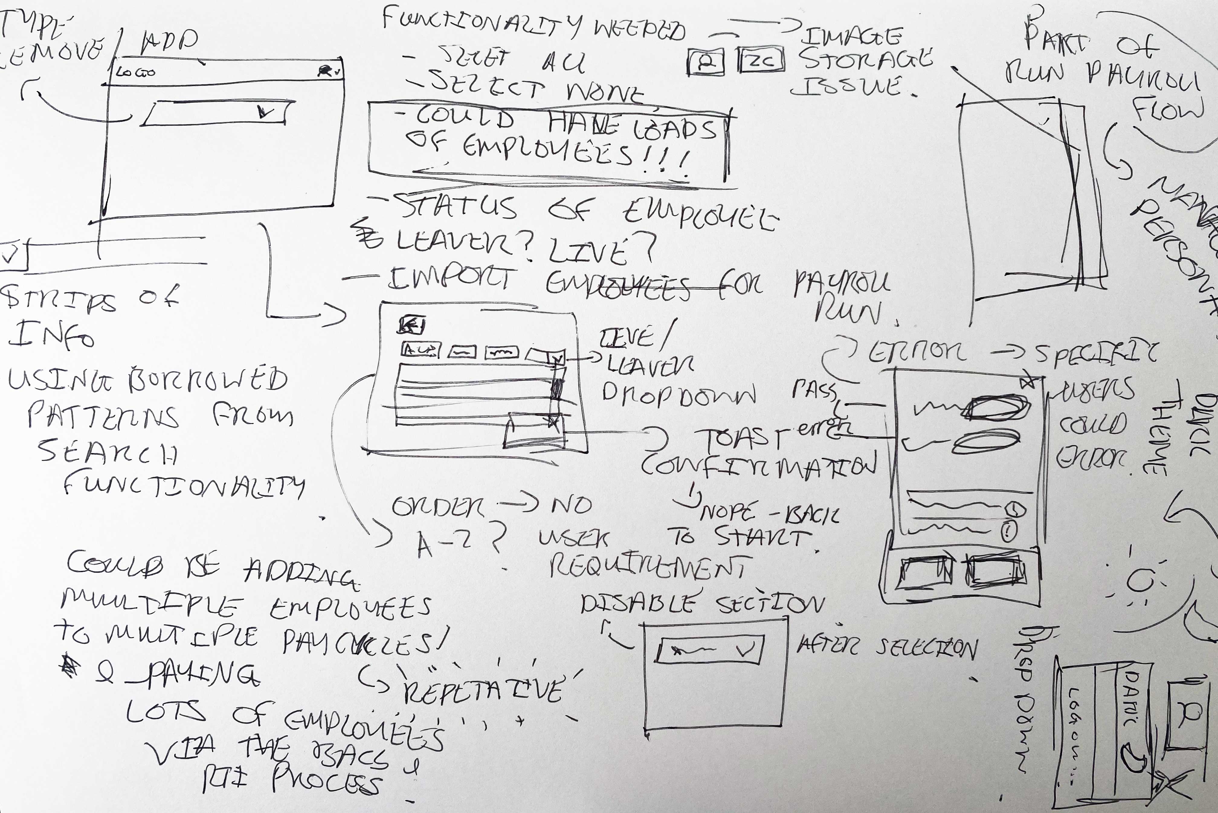
Exploring the different mechanisms I could use to help make this process more intuitive.
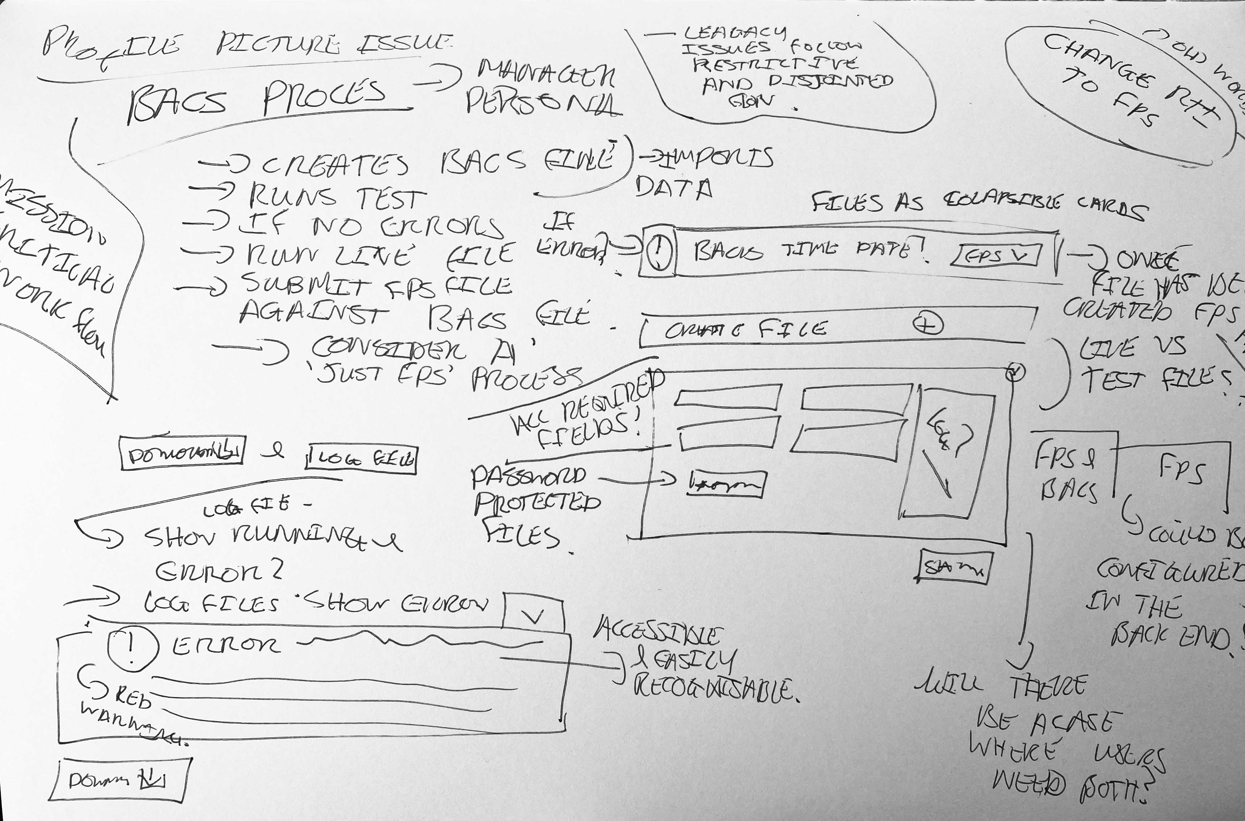
Exploring error handling for specific files and some of the use cases surrounding this.
Empathy Mapping
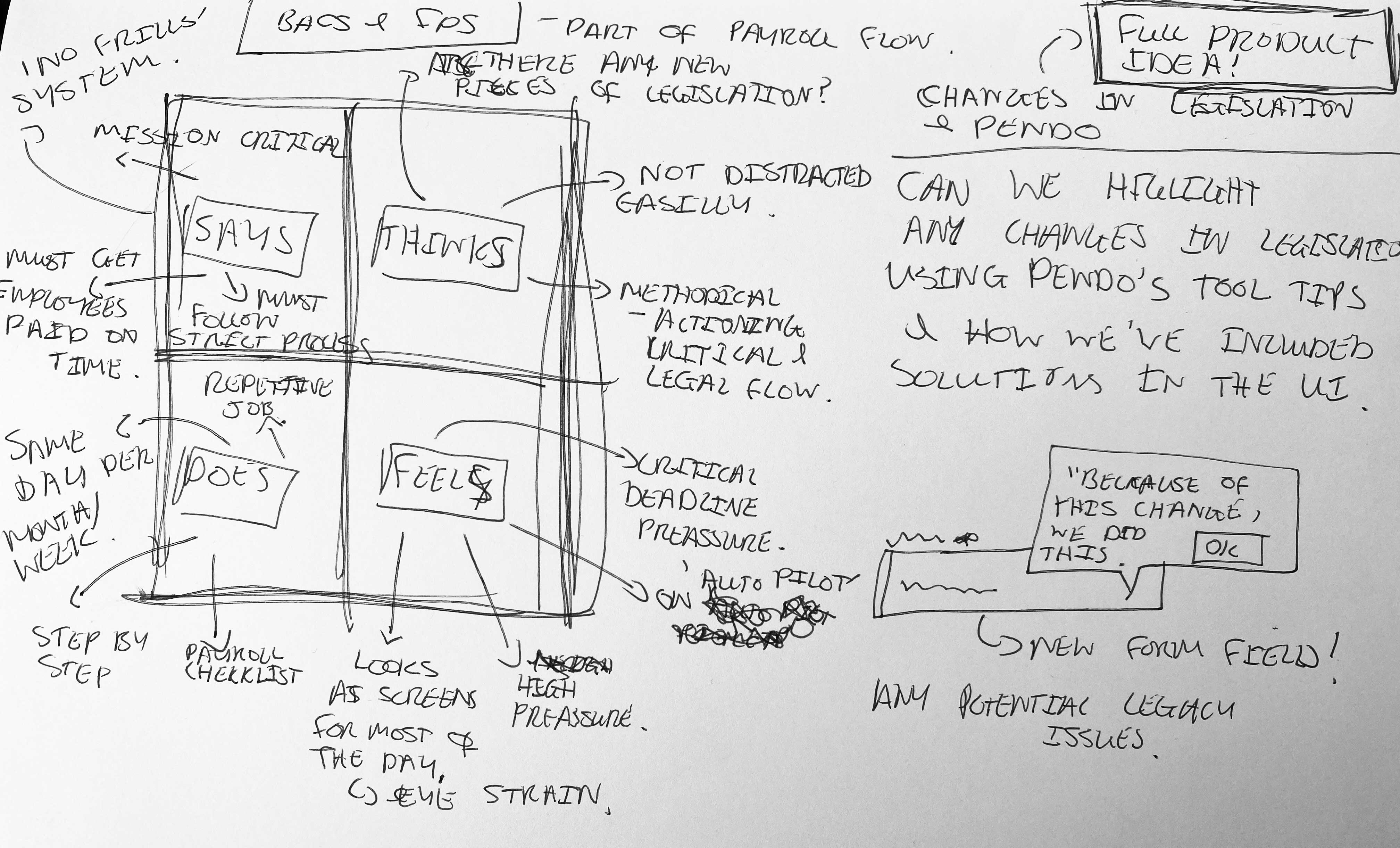
Empathy mapping lead to a lot of good points, but also some future product ideas.
high Level Process Flow
Errors are typically caused by the user's BACS file (and HMRC errors) and these issues will flag during test/live submissions. All other errors are handled with form validation.
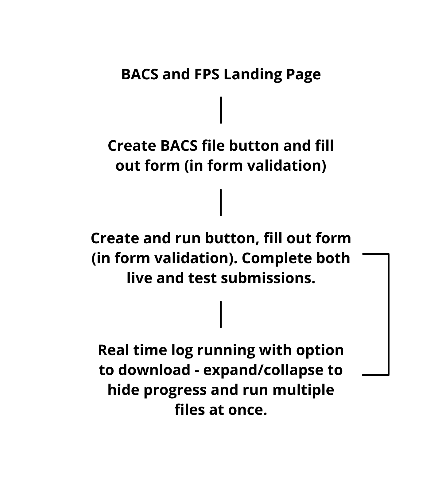
Lofi Prototype and Wireframes
When designing new functionality, I use a combination of low-fi and high-fi elements in my prototypes to show new elements in the context of both pre existing and validated parts of the design that are being used currently.
A 'dashboard' style layout for returning to BACS and FPS, as well as creating new ones.
A stripped back FPS form including functionality to run both test and live files.
3 Amigos - Developer Collaboration
After the initial design in the form of a low fidelity prototype had been signed off by the product owner, a meeting between myself, a front end developer and a backend developer took place to resolve the technical issues (caused by the API or any other areas) that have occurred as a result of my designs and to identify any areas of potential scope creep.
Solutions
• Including loading spinners to replace any loading bars. Utilising copy to manage expectations.
• Making some changes to the API in order to increase the amount of data that we can utilise on the front end now and in future.
• Choose to not show the 'not user friendly' error states and use an 'error formatter' to turn the API errors into something more readable.
Designs were presented using an interactive prototype which the developers also had access to ahead of time, giving them times to review the designs, as well as research any solutions to any problems that they have found.
These are some of my favourite meetings!
Testing and Feedback
Testing types
• Online user testing scenarios
• Customer demos
• Feedback via Parallel runs
In order for users to onboard to our product, we have them use it alongside their existing provider in order to ensure there are no gaps or issues within a tax year. For example, no issues with the customer's employee pay and any feedback that users may have.
Feedback Results
• "We sometimes just need the FPS process and not the BACS and FPS."
• "Do we always have to produce a BACS file, even though we do that externally?"
• "Where is the HMRC log?"
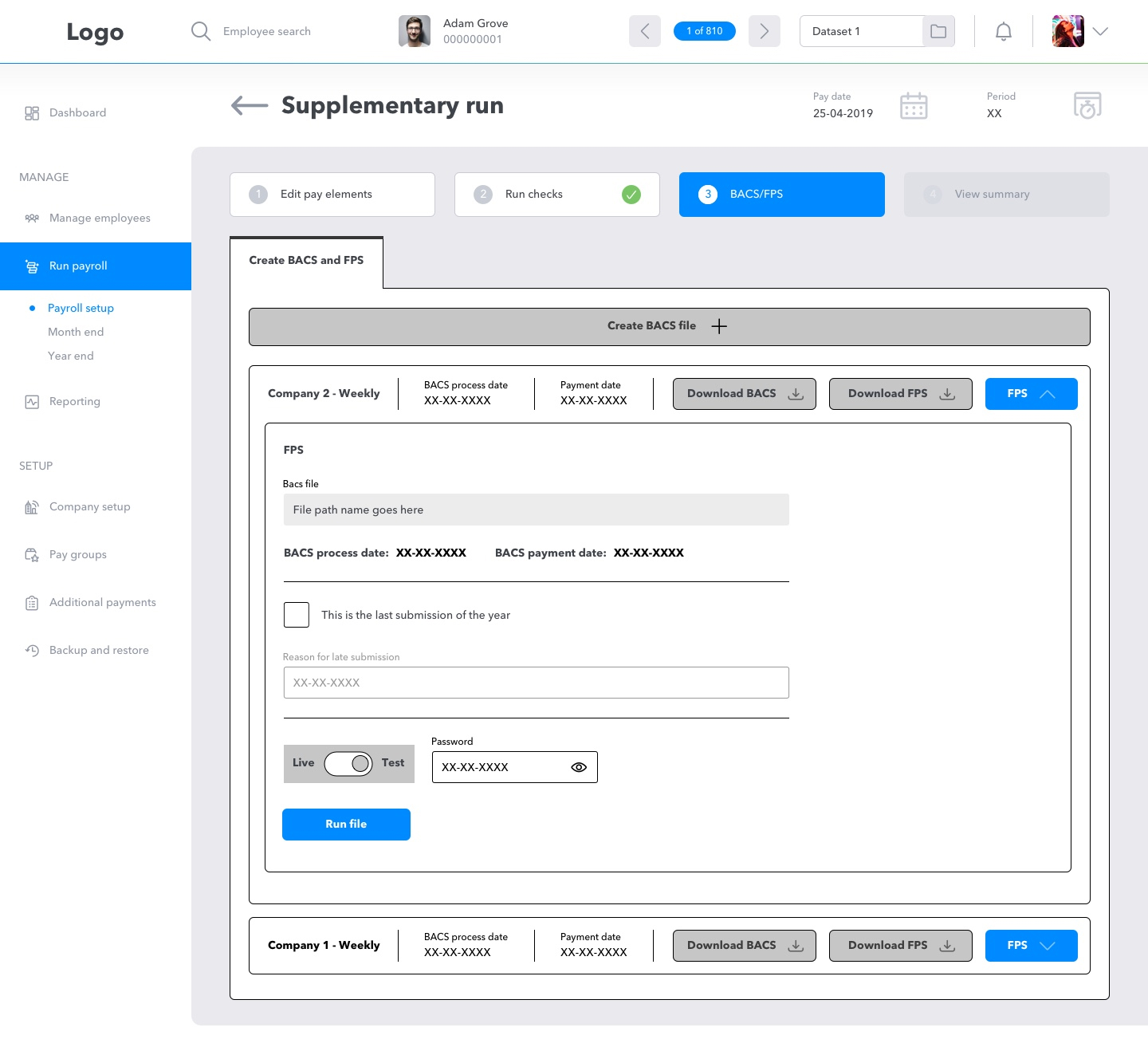
I need to show the option to create BACS file with and FPS against it, as-well as JUST an FPS for users who need to submit an FPS submission when following a BACS process externally, this is a process which can occur with smaller businesses, payroll bureau or as a one off.
While testing, I found that the information and level of detail provided by the HMRC log was useful and sometimes vital to the user in order to resolve issues with an individual employee's payroll.
• Online user testing scenarios
• Customer demos
• Feedback via Parallel runs
In order for users to onboard to our product, we have them use it alongside their existing provider in order to ensure there are no gaps or issues within a tax year. For example, no issues with the customer's employee pay and any feedback that users may have.
Feedback Results
• "We sometimes just need the FPS process and not the BACS and FPS."
• "Do we always have to produce a BACS file, even though we do that externally?"
• "Where is the HMRC log?"
I need to show the option to create BACS file with and FPS against it, as-well as JUST an FPS for users who need to submit an FPS submission when following a BACS process externally, this is a process which can occur with smaller businesses, payroll bureau or as a one off.
While testing, I found that the information and level of detail provided by the HMRC log was useful and sometimes vital to the user in order to resolve issues with an individual employee's payroll.
Design Changes Based on Feedback
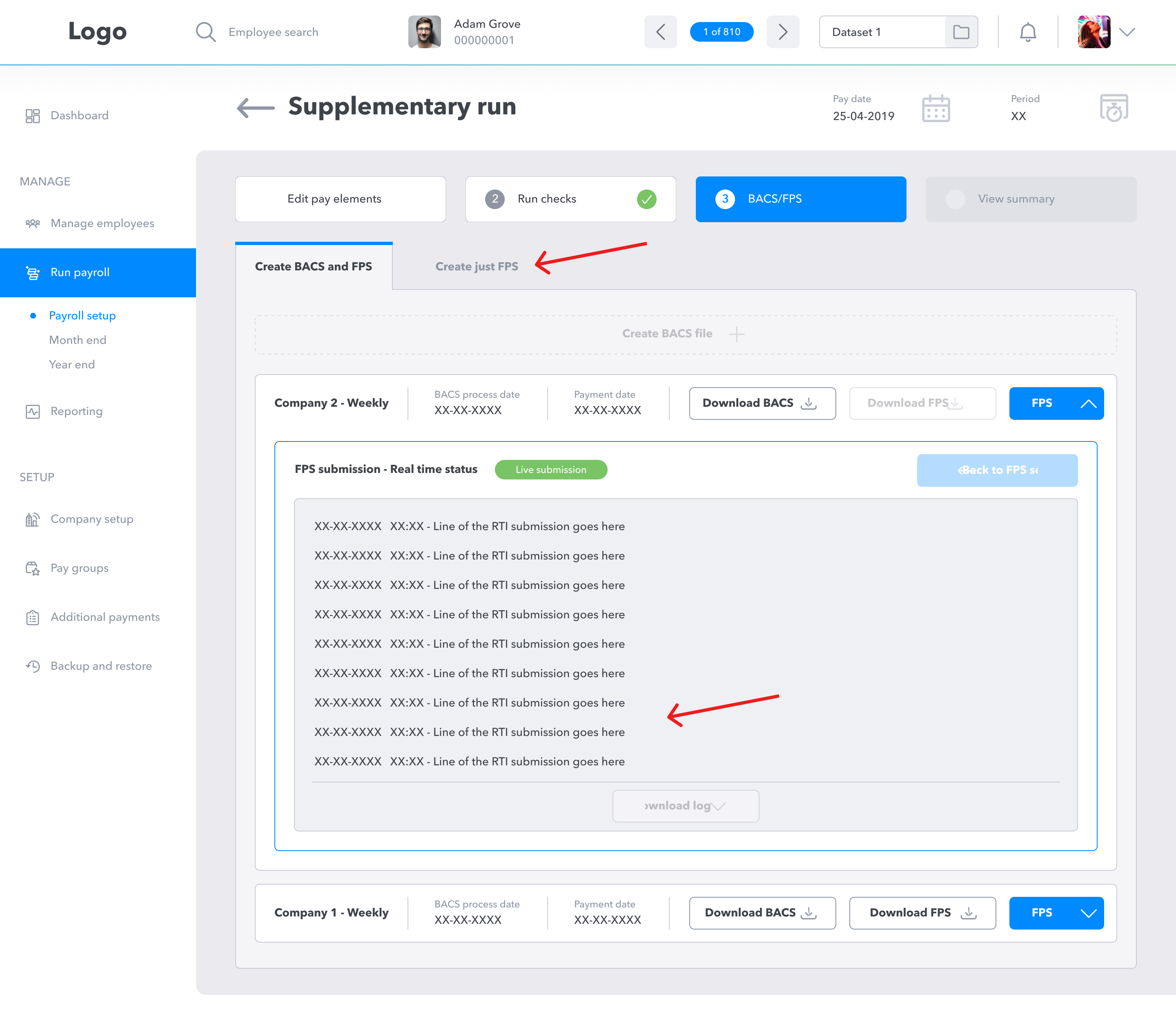
Adding a HMRC log during the submission in real-time so that the user get immediate Feedback and a tab to submit just an FPS form.
User Feedback from Design Changes - User Testing round 2
Testing types
• Online user testing scenarios
• Customer demos
• Feedback via Parallel runs
Feedback Results
• "I really like that I can see the user log in real-time."
• "The FPS flow is easy to use, I like that I can do just an FPS submission."
• "This is such an easy to use piece."
• "The download is a must, thank you for including it."
Product therefore signed off the designs and I moved into the dev handover.
Measuring Success, How Might We's and next steps
How are we measuring success?
• There is no impact on the payroll process, (e.g., difficulty using the process, time taken for training and integrating a new process.) - Success - No training or extra support needed
• Pendo shows that the functionality has been regularly and repetitively used over a 30 day period. - Success - Usage is inline with typical Payroll cycle usage. The workflow shows expected functionality.
• There is minimal impact on the development team. - Success - No further work is scheduled on this functionality.
• There is minimal impact on both support and the product team. - Success - There were no reports of issues from the support or product teams.
• We have addressed the 'HMWs'. - Success
Did we solve our 'HMWs'?
• Speed up the current process. - The new process is faster and is made up of less steps.
• Ensure users can navigate the process using tabbing and 'excel' type shortcuts. - I collaborated with the developers to ensure this was included.
• Ensure compliance with HMRC. - By working with the PO and PM, I ensured that the functionality is HMRC compliant.
• Ensure industry best practices are incorporated. - By working with the PO and PM, I ensured that industry best practises were followed. This included copy and functionality.
• Navigate technical limitations through the API in a way in which it doesn't effect the UX. - As the API was throwing us more modals than needed we worked to only show ones valuable to the user. It is clear that there is a much bigger issue with the API impacting the UX and this will need further discussion in order to resolve.
• Reduce the amount of modals, it is currently easy to loose track on where users are in the process. - There are now fewer modals as part of the functionality.
Next Steps
• Take more steps towards making the product WCAG AA compliant - Can we incorporate improvements when we add new functionality?
• Discuss with the team about changing the size of tick boxes in the design system. While designing they felt too small and while payroll users are using the product, there might be an issue with making multiple attempts to hit the target area as well as when users are mass selecting but not selecting all. Is this an issue with other products also? I have found that tick boxes aren't currently 24px x 24px!
• During the feedback round we found that some users are confused about the colours of the profile pictures. To avoid the need for storing profile pictures we introduced a random coloured background with the user's initials in them. The users discussed how they felt it appeared that these colours represent something. This is something that needs addressing asap across the whole product while we do not have the server space for photo uploads, if that is something the users even want?
• Discuss the impact of the current API on the UX and how that will impact users. We should then discuss a plan moving forward in order to remove the current issue around designing with this API.
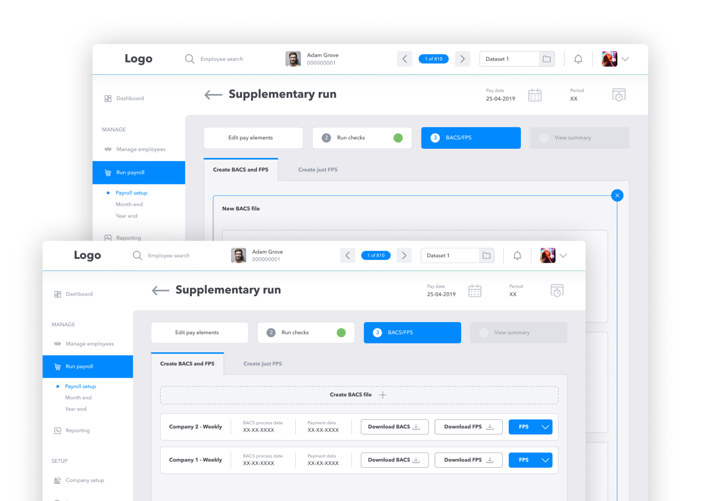
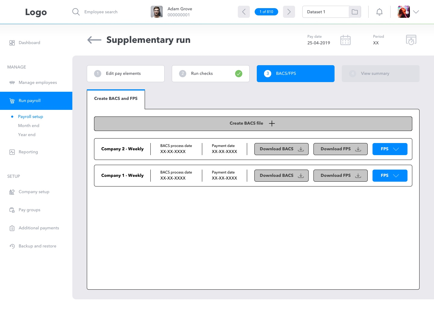
The Final Designs
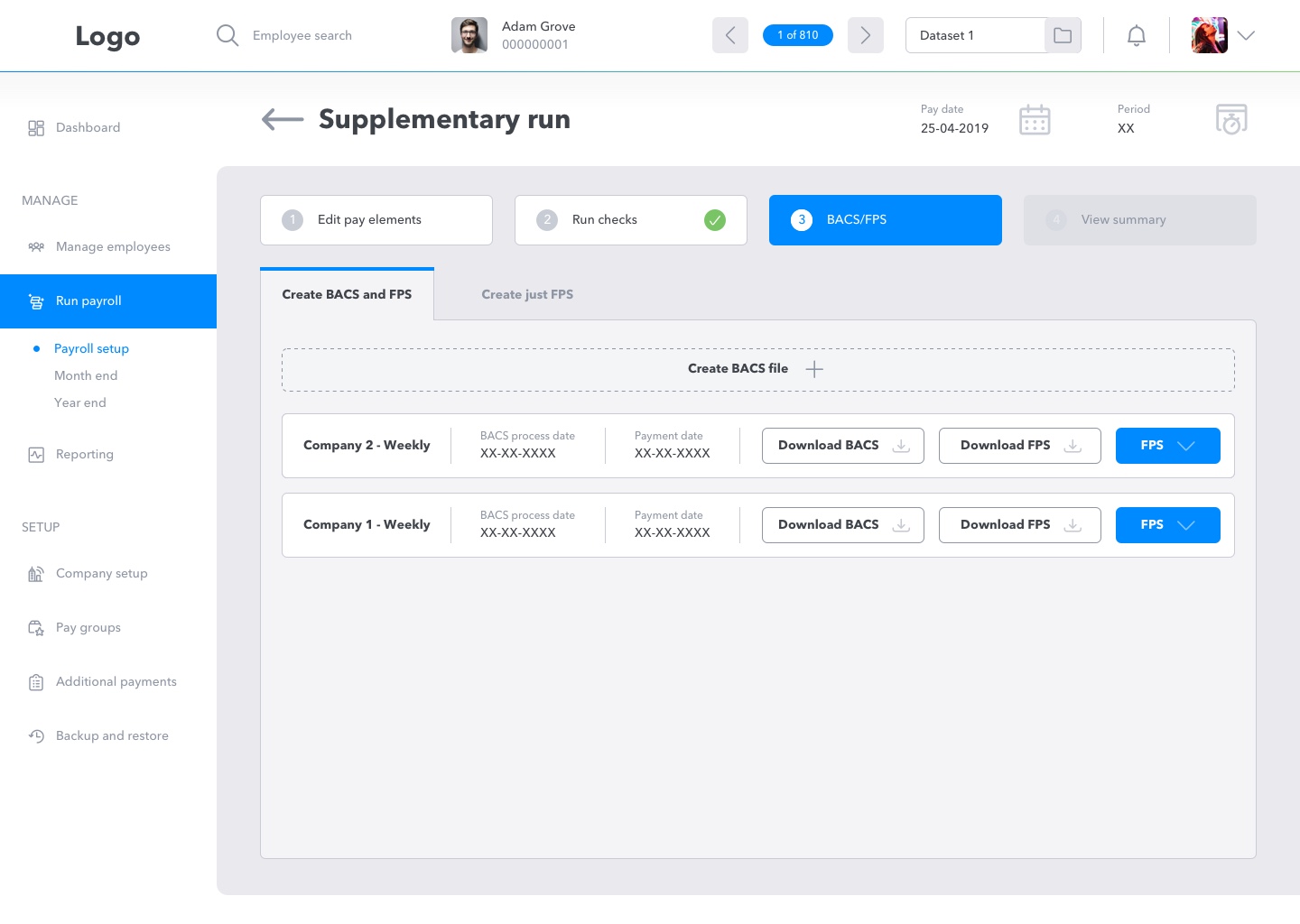
A BACS and FPS dashboard with capacity for agencies dealing with mass submissions for many companies and a 'just FPS' submission for smaller companies or companies who don't use
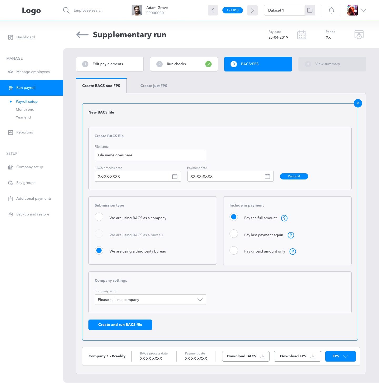
A slicker and easier to follow form. Legally necessary but now presented as easier and faster to use tab controls.
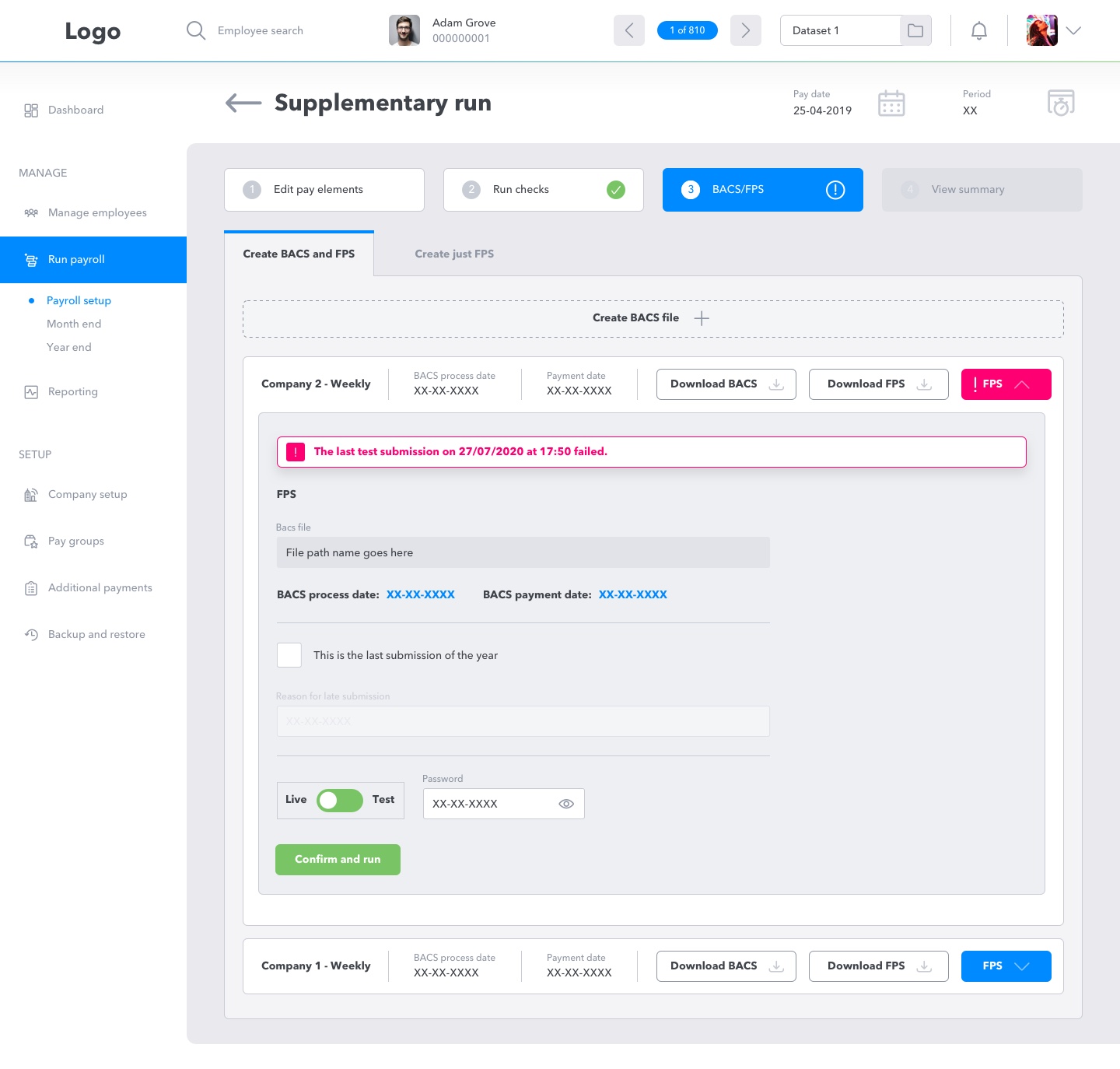
Error handling during a live submission to HMRC.
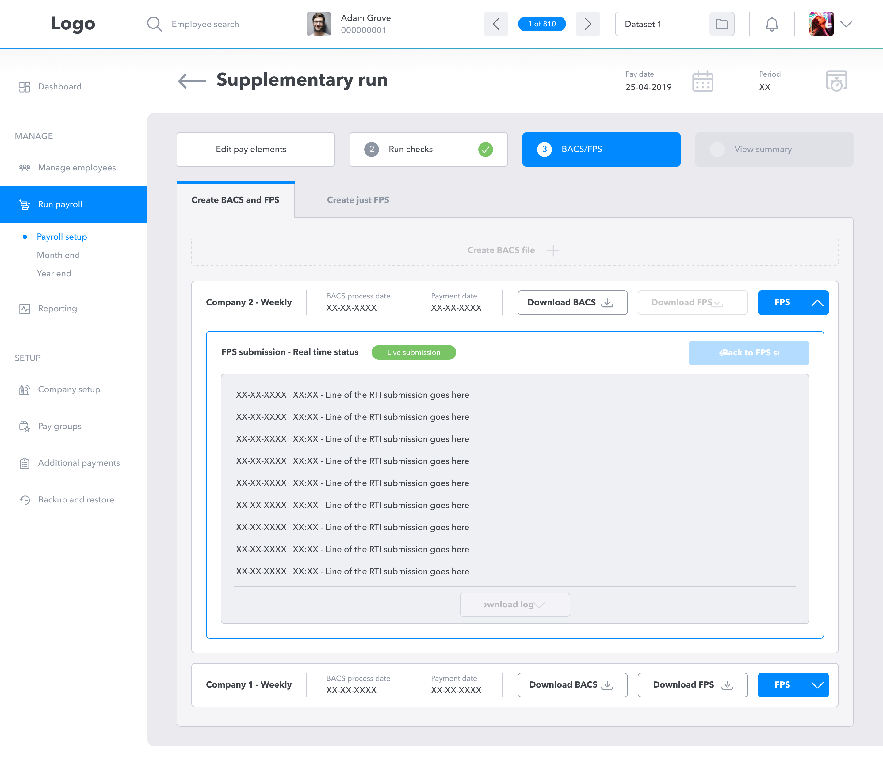
Active submissions can be viewed and seen directly on the BACS and FPS 'dashboard' for instant feedback, or be reviewed at a later date.


